

Hi social pro 👋
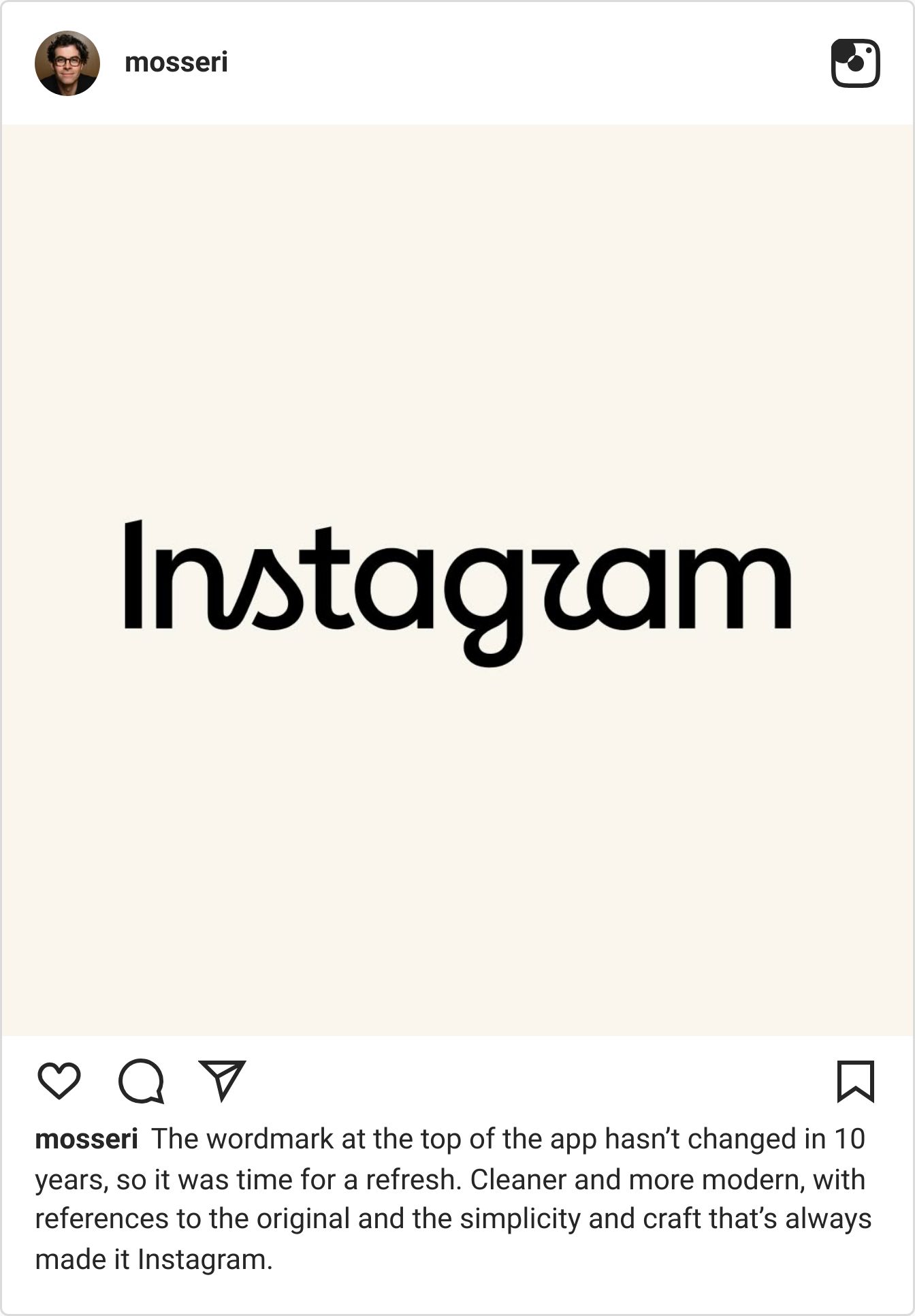
Head of Instagram, Adam Mosseri, recently shared Instagram’s new wordmark - the first update in 10 years.
And the comment section had…thoughts.
We ran 5.1K comments from under Adam’s post through Siftsy to see how the announcement landed, and get to the root of the backlash.
Let’s get into it 👇
— Brett
From the feed: What went wrong with Instagram’s rebrand announcement
Rebrands are tricky.
Rebrands at Instagram’s scale - i.e. 2 billion monthly users and a logo that’s been embedded in the visual language of the internet for over a decade - are straight up daunting.
The pressure to modernize without alienating an audience that large is enormous, and the margin for error is slim.
On August 13th, Adam Mosseri posted their new wordmark to his Instagram page: a refreshed cursive logo, described as cleaner and more modern.
We ran 5,100 comments on that post through Siftsy to understand how it landed.
The short answer is: not as well as Instagram probably hoped.
1. Reactions leaned more negative
31.8% of comments were negative leaning and a further 6.7% were very negative - making the critical camp measurably larger than the enthusiastic one. But the more interesting question is: why?
Instagram has changed its app icon, its UI, its algorithm, and its feature set repeatedly over the years - often to significant backlash that eventually fades.
The wordmark is different. It sits at the top of the app every time someone opens it, it appears in press coverage, in brand partnerships, in creator content. It’s one of the most visible elements of the Instagram identity, and it’s been consistent for a decade.
So, in addition to reacting to a design choice, commenters are also reacting to the disruption of something they’d stopped noticing - which is often when you realize how much it mattered.

2. One letterform broke the internet
9% of comments are about a single design detail: the cursive 'r' in the new wordmark reads as a 'z' to a significant portion of the audience.
"Instagzam" - the meme that emerged within hours of the announcement - generated thousands of likes before the post had even reached peak virality, and has since become a widespread trend with brands creating their own versions.
Which is what makes managing this reaction particularly challenging for Instagram. People aren't angry about the letterform, they're amused by it. And that's actually harder to address than straightforward criticism.
You can respond to anger. You can clarify a misunderstanding. It's much harder to neutralize a joke that 6,500 people have already decided is funny, especially when the joke is also a legitimate readability concern.

3. The design critique was specific
14% of comments are focused on design - and the feedback goes well beyond "I don't like it."
Commenters are picking apart specific letterforms, drawing comparisons to other scripts, and flagging legibility concerns across different languages. Which, for a platform used by people across dozens of writing systems, matters more than it might seem.
The wordmark that reads cleanly in one language context doesn't necessarily translate in another, and Instagram's global audience figured that out in the replies before anyone had formally asked them.

What can this teach us about rebrand announcements?
Once "Instagzam" had thousands of likes, it had already become the story. Forget the hours of work and design philosophy that went into the rebrand - in the end, it was a single cursive ‘r’ that reads like a ‘z’ that would steal the narrative.
And the window to get ahead of that kind of shift closed almost immediately after the post went live.
That's the thing about announcing a rebrand on social. The audience verdict arrives fast, it's specific, and it compounds. Knowing what's being said in those first few hours (and acting on it) is a very different proposition to reading a summary the following week.
Pulse check
What did you think of Instagram's new wordmark?
On our radar

What does it actually mean when a post gets a lot of comments?
A study of nearly a million New York Times comments found that emotional stories draw bigger crowds, while analytically dense stories produce fewer but sharper conversations.
The researchers call it a "data elite" - and it has some interesting implications for how social teams interpret comment volume.
Trend watch
What the Siftsy team has been reading, saving, and talking about this week.


Thanks for reading The Signal.
If something here sparked a thought or reaction, drop it in the comments (aka reply back here).
See you next week,
Research and editorial support by Amy Watts