

Hi social pro 👋
In case you’ve somehow missed all of the discourse (we’re jealous of your screen time if you have), Spotify updated their app logo.
And despite not mentioning it directly in their content, the comment sections of their most recent posts have been flooded with debate about the new disco-themed icon.
We wanted to dig into what those comments are actually saying, and whether it aligns with the narrative that’s forming elsewhere online.
Let’s get into it 👇
— Brett
From the feed: How Spotify's comment section really feels about that new logo
Spotify turned 20 this year. And to celebrate, they replaced their iconic green circle app icon with a disco ball - glittery, reflective, and about as far from minimalist as a brand of Spotify's scale tends to go.
And the internet had…mixed reviews.
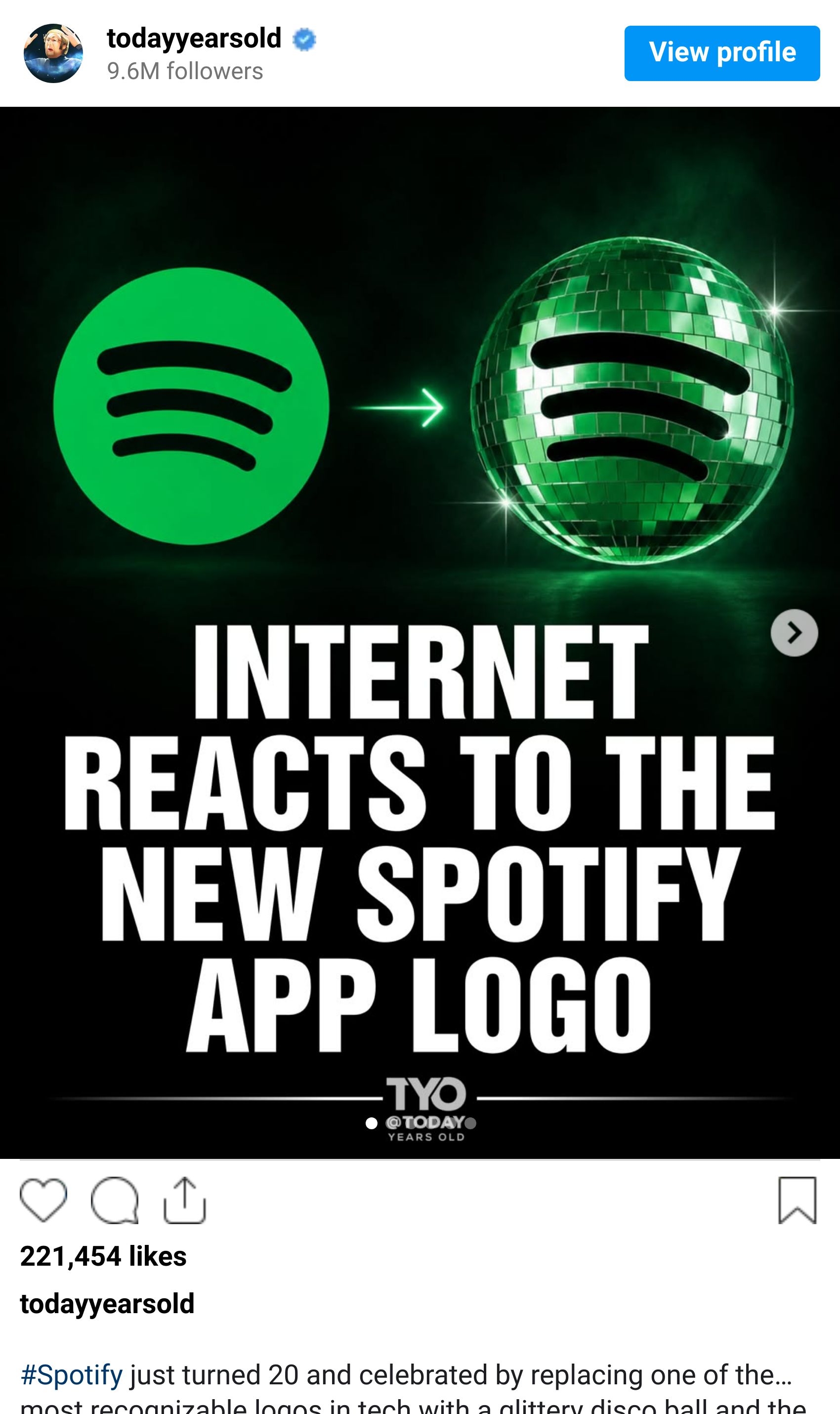
Spotify themselves haven't posted about it. No announcement, no campaign, no acknowledgment that anything has changed. But their audience noticed immediately, and with no official post to direct the conversation toward, it landed somewhere else entirely: the comment sections of whatever Spotify happened to publish next.
We ran those comments through Siftsy - 1,600 comments across four posts, none of which were about the logo - to find out what the audience is actually saying, and whether it lines up with the narrative that's been forming online and in the press.
Here’s what we found:
1. The logo took over posts it had nothing to do with
The first thing worth noting is the sheer volume of the takeover. 35.5% of comments across four unrelated posts were about the logo. Siftsy flagged it as a core conversation, meaning it wasn't just a notable thread, it had become the dominant one.
Spotify posted about artist moments, live events, and other content entirely. Yet a third of their comment section became a referendum on a change the brand hadn't acknowledged.
That's a meaningful signal about how activated this audience is. When there's no official place to direct the conversation, it finds its own outlet.

2. The press narrative and the comment section are telling different stories
Coverage of the logo change has leaned into the controversy angle: a divisive rebrand, an audience split, a bold move that not everyone is on board with. The comment section is more specific than that.
The dominant voice is pro-disco ball. Comments are overwhelmingly calls to keep it - describing it as fun, characterful, and a refreshing departure from the minimalist icons that saturate most phone screens.
The criticism that exists is largely focused on readability: the contrast, the perceived "loading" appearance, the difficulty of spotting it on certain devices. The concept itself has far more defenders than detractors.
3. The audience has already solved the problem
Where negative feedback does appear, it's remarkably constructive.
A recurring theme across the dataset is the request for a toggle option - let users who want the disco ball keep it, and give those who don't a way to revert.
That's a more considered ask than a straight rollback, and it reflects an audience that has already done the product thinking and handed Spotify a solution in the comments.

Read more about Burger King’s “You’re the King” campaign here
4. An unintended consequence
Not every reaction was about aesthetics. A portion of comments connected the new icon to perceived app malfunctions: the loading appearance of the disco ball leading some users to assume something was wrong with the app, and others linking the visual change to playback issues and server outages they were experiencing.
A design decision, made without context or communication, created confusion that spilled into product perception.
It's a reminder that how a change is communicated (or not communicated) shapes how it lands just as much as the change itself.
The most interesting thing about this story isn't even the logo, but what the absence of an announcement produced. By not acknowledging the change, Spotify left 1,600 people with nowhere official to direct the conversation - so it colonised every post they published.
The result is an enormous volume of unsolicited brand feedback, product suggestions, and genuine emotional investment in a visual identity decision.
We’ll just have to wait and see whether any of it gets used…
Pulse check
What's your take on the Spotify icon debate?
On our radar
At its peak, one marketing company was running 65,000 fake social media accounts.
This article by Lane Brown for New York Magazine exposes the industrialisation of online opinio, and how the signals social teams use to measure what audiences think can now be fabricated at scale.
For example, Justin Bieber's Coachella performances reportedly had paid clip campaigns running on Discord while he was still on stage.
If manufactured consensus is becoming the norm, the ability to read a comment section and know what's real becomes a lot more important than most organisations currently treat it.
Trend watch
What the Siftsy team has been reading, saving, and talking about this week.


Thanks for reading The Signal.
If something here sparked a thought or reaction, drop it in the comments (aka reply back here).
See you next time,
Research and editorial support by Amy Watts